

You are using an out of date browser. It may not display this or other websites correctly.
You should upgrade or use an alternative browser.
You should upgrade or use an alternative browser.
Dragons Lair Control Panel Overlay Artwork Recreation.
- Thread starter conan
- Start date


If yours is the good one I stand corrected – ie no artefacts (clean) – I apologise!
Early morning!
Early morning!

Lol!If yours is the good one I stand corrected – ie no artefacts (clean) – I apologise!
Early morning!
Apology accepted! But you paraphrased one of my sentences that wasn't meant for you. It was a conversation with someone else, and that's different.

Thanks for hijacking my thread
Do me a favour and please stay out of my thredas. I dont really like you or your attitude. I watched you get banned on Dragons Lair Fans for good reason. This thread has now been hijacked with you explaining how great you are and what people should do and your massive logo splashed over everything.
There are plenty of talented people doing this work who just keep quite and get on with it. Im now getting dragged into having to explain that i have been doing this much longer than you, professionally, for some of the largest companies out there and thats not what this is all about.
Literally spent years working in offset...As I mentioned, you may have your own color preference, but in offset printing, cyan is 100% saturated, magenta is 100% saturated, yellow is 100% saturated, and so on. If red predominates in Dirk's suit, that red will be a pure red, not an orangey version of the color sprinkled with yellow dots.
CMYK printing is already muted enough if not handled correctly without you lowering the color even further, but it's your file and your printed reproduction. I'm not interfering with your preferences; I'm stating an objective fact. I'm telling you this without any ill will.
Cheers!
Do me a favour and please stay out of my thredas. I dont really like you or your attitude. I watched you get banned on Dragons Lair Fans for good reason. This thread has now been hijacked with you explaining how great you are and what people should do and your massive logo splashed over everything.
There are plenty of talented people doing this work who just keep quite and get on with it. Im now getting dragged into having to explain that i have been doing this much longer than you, professionally, for some of the largest companies out there and thats not what this is all about.
Anyone thats worked proferssionally in this industry will know that what you see on screen (unless you are using a calibrated monitor) is absolutely not what you get in print.
So the sauturation level in these image has been setup for output on a specific press and is still a work in progress.
The original CPO's were printed and glued to a very thick lexan that has quite a rough texture (by todays standards). As I said I have roughness tested it and have found a close match in the USA.
The issues with scanning this artwork (from anything other than the original paintings) is that not only are you scanning a printed halftone pattern you are also scanning through almost a frosted surface that refracts the light, breaks up edge detail and generally causes quite a lot of interference.
The scan of the original top section artwork, while great, isnt much use when compared to the lower front.
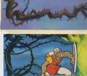
Scan of original artwork top as compared to a scan of an original CPO front section.
As you can see contrast and detail are nowhere near the same.
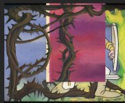
I even considered painting in detail based on the original artwork as a reference, this work in progress screengrab shows a rough pass (that needs refining), but that wouldnt be failthfull to the original so I stopped with this concept.
Using AI or any tool that alters the original isnt of interest to me either.
The conclusion was that until the original artwork of the front section becomes available its pointless to attempt to incorperate the new scan with the old. They are just too far apart.
So what we are doing now is intergrating the colour pallett, contrast, tonal range, saturation and 'feel' of the original with my version to get something that will print out in good quality and reflect the art as originally intended.
I Hope to have an update on this later next week.
So the sauturation level in these image has been setup for output on a specific press and is still a work in progress.
The original CPO's were printed and glued to a very thick lexan that has quite a rough texture (by todays standards). As I said I have roughness tested it and have found a close match in the USA.
The issues with scanning this artwork (from anything other than the original paintings) is that not only are you scanning a printed halftone pattern you are also scanning through almost a frosted surface that refracts the light, breaks up edge detail and generally causes quite a lot of interference.
The scan of the original top section artwork, while great, isnt much use when compared to the lower front.
Scan of original artwork top as compared to a scan of an original CPO front section.
As you can see contrast and detail are nowhere near the same.
I even considered painting in detail based on the original artwork as a reference, this work in progress screengrab shows a rough pass (that needs refining), but that wouldnt be failthfull to the original so I stopped with this concept.
Using AI or any tool that alters the original isnt of interest to me either.
The conclusion was that until the original artwork of the front section becomes available its pointless to attempt to incorperate the new scan with the old. They are just too far apart.
So what we are doing now is intergrating the colour pallett, contrast, tonal range, saturation and 'feel' of the original with my version to get something that will print out in good quality and reflect the art as originally intended.
I Hope to have an update on this later next week.
Last edited:
Sorry, I couldn't ignore the challenge!
*I think it took me longer to take the screenshot, rename it, and post it than the Photoshop retouching!
The color of the thorny bush is the same, or almost. I could refine it further!
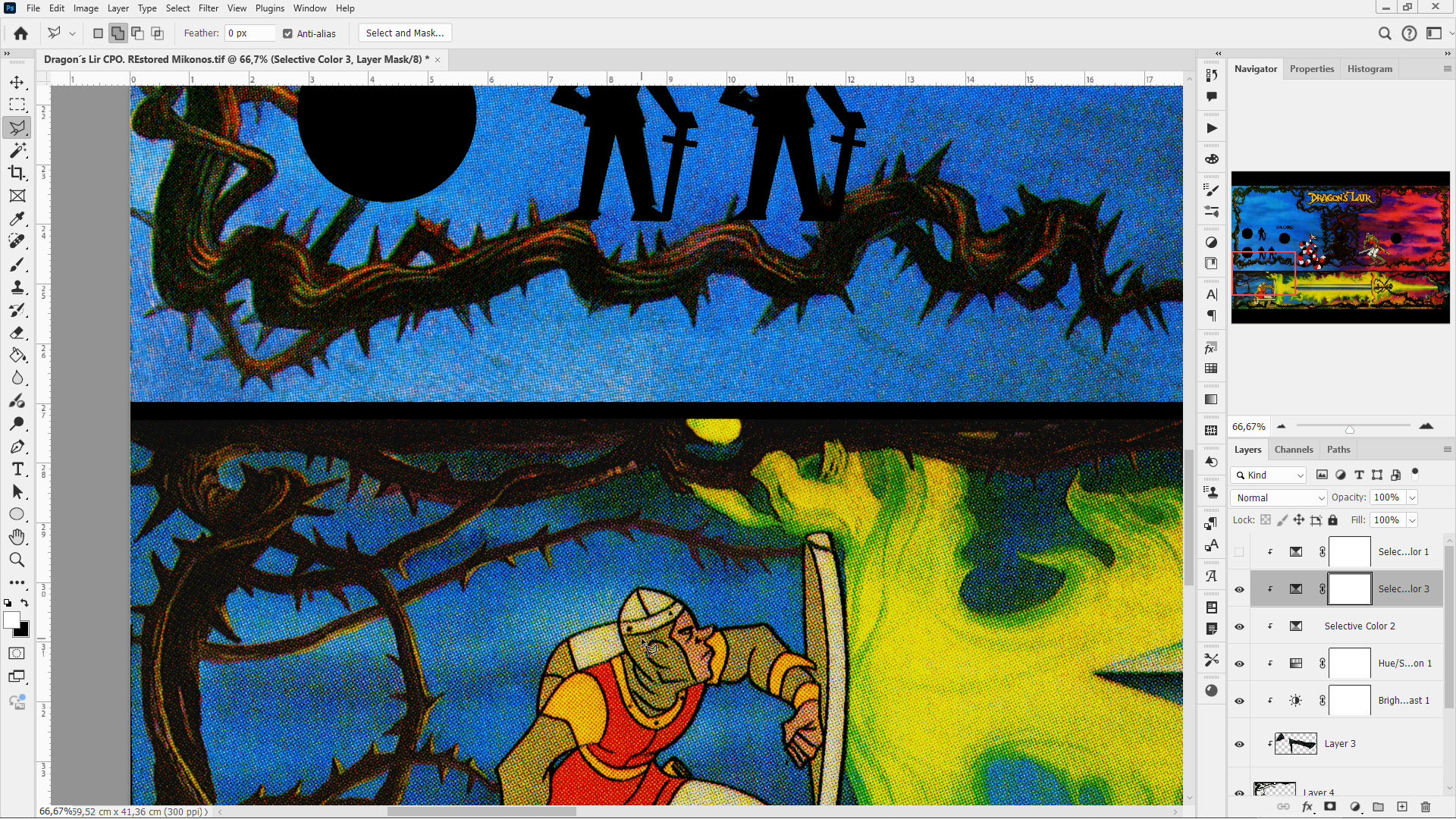
*The screenshot is very large so you can see what I've done. I'm not a professional because I don't make a living from this; I do it as a hobby, so I've relied on my personal talent.
I hope I've solved the problem so our Cimmerian friend can continue making progress.
*I think it took me longer to take the screenshot, rename it, and post it than the Photoshop retouching!
The color of the thorny bush is the same, or almost. I could refine it further!
*The screenshot is very large so you can see what I've done. I'm not a professional because I don't make a living from this; I do it as a hobby, so I've relied on my personal talent.
I hope I've solved the problem so our Cimmerian friend can continue making progress.
Don't worry, I won't participate anymore, and I'll continue to follow your progress with interest.
Don’t give up your day job! 😆 😉Sorry, I couldn't ignore the challenge!
*I think it took me longer to take the screenshot, rename it, and post it than the Photoshop retouching!
The color of the thorny bush is the same, or almost. I could refine it further!
*The screenshot is very large so you can see what I've done. I'm not a professional because I don't make a living from this; I do it as a hobby, so I've relied on my personal talent.
I hope I've solved the problem so our Cimmerian friend can continue making progress.
You are banned from KLOV / Musium of the Game, you are banned from DLF, you rip people off, and you have average Photoshop skills at best, all wrapped up in a ridiculous ego, arrogance, and a complete lack of humility or self-awareness. Ill ask you again to keep out of my threads.
Thought I would share this as an exaple of screen art vs output print. This was generated from the original 'so called' desaturated artwork and as you can see its still saturated quite heavily and needs more work, espacialy with a colour shift in the blues. This was my first output test and I wanted to check it 'on game' rather than just look at a proof sheet or no test at all. Bit more work to do but i think we are really close to getting this looking good when I incorperate Brians colour space ref
from his original artwork.
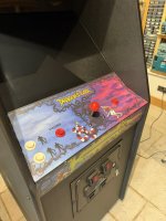
I think its worth sharing a few ref images so you can get an idea of the saturation levels of original art. Remember the images are always subject to the colour temperature (kelvin) of the lights being used on location as well as the camera used and its settings / white balance etc...
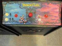
The next image is possibly one of the most interesting, in that the detail of the thorns can very clearly be seen. This is a very rare control panel from an unknown (to me) version of the game.
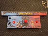
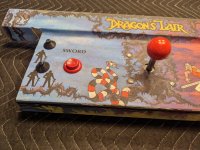
The contrast and level of detail in this version is different and much superior to other original CPO's and reflects the original art much closer.
This is why research in my opinion is vital to correct reproduction/ restoration...
Ill update with new work on my art asap....
from his original artwork.
I think its worth sharing a few ref images so you can get an idea of the saturation levels of original art. Remember the images are always subject to the colour temperature (kelvin) of the lights being used on location as well as the camera used and its settings / white balance etc...
The next image is possibly one of the most interesting, in that the detail of the thorns can very clearly be seen. This is a very rare control panel from an unknown (to me) version of the game.
The contrast and level of detail in this version is different and much superior to other original CPO's and reflects the original art much closer.
This is why research in my opinion is vital to correct reproduction/ restoration...
Ill update with new work on my art asap....
Last edited: