Looking a Joust control panel overlay. Anyone got an idea where beast to order one?
You are using an out of date browser. It may not display this or other websites correctly.
You should upgrade or use an alternative browser.
You should upgrade or use an alternative browser.
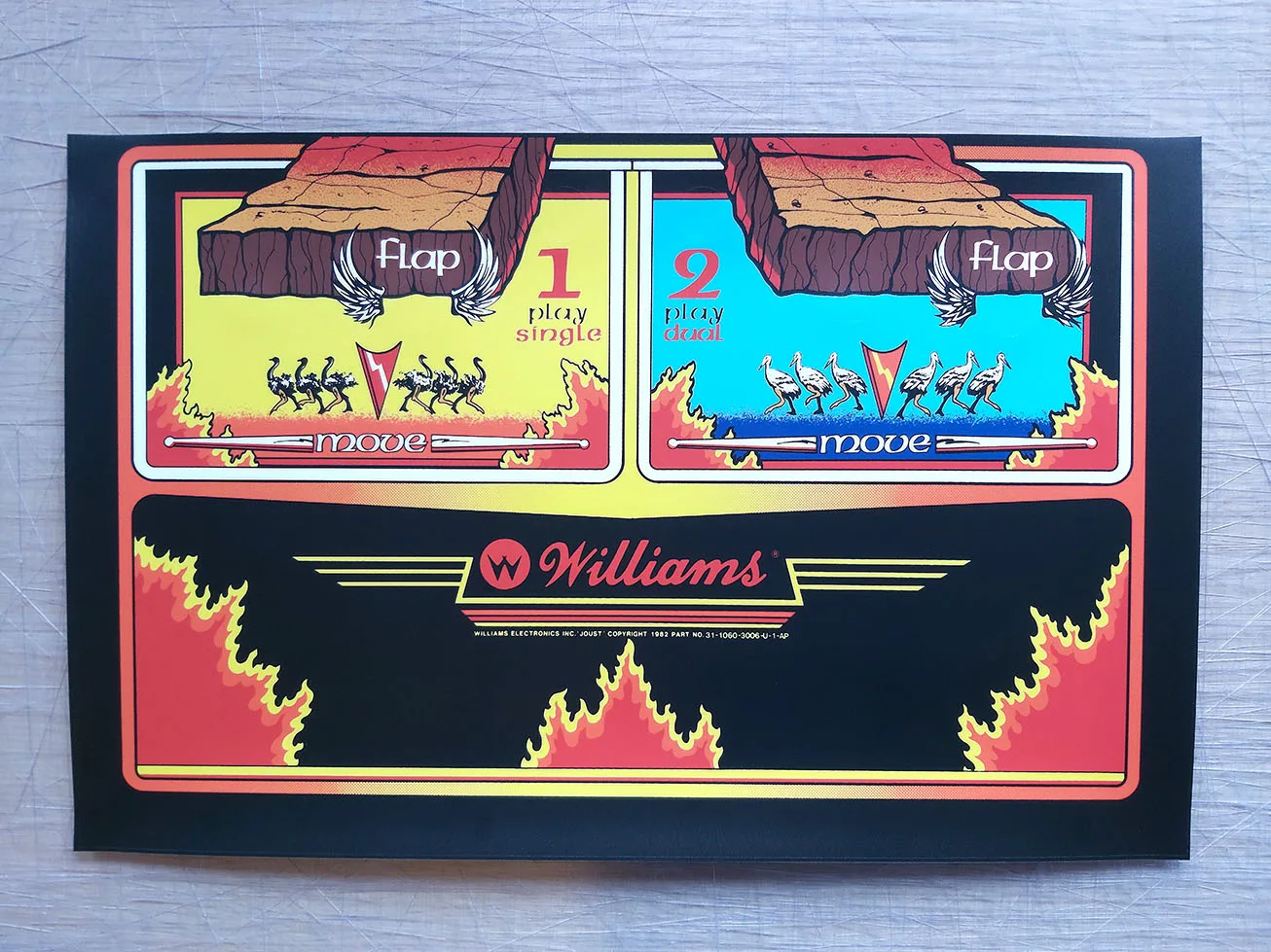
Joust CP overlay
- Thread starter Phils Arcade
- Start date
Going to answer my own question, lol.
 arcadeartrepro.com
Joust CPO - Arcade Art Repro
Reproduced from scan for accuracy For upright cabinet Laminated with a scratch resistant textured polycarbonate laminate Size w 625 x h 400 mm
I'm one of the best accurate arcade and pinball art restorer out there, and I've restored Joust this control panel Overlay:
I'm going to show you my restoration in detail that I published a few years ago and you're going to look for the differences with that same one you've seen and others that you can find on the Internet:
"Joust Control Panel Overlay" (WILLIAMS) arcade artwork file restored in Zona Arcade by Mikonos.

Details in "Joust Control Panel Overlay" (WILLIAMS) arcade artwork file restored in Zona Arcade by Mikonos.

I'm going to show you my restoration in detail that I published a few years ago and you're going to look for the differences with that same one you've seen and others that you can find on the Internet:
"Joust Control Panel Overlay" (WILLIAMS) arcade artwork file restored in Zona Arcade by Mikonos.
Details in "Joust Control Panel Overlay" (WILLIAMS) arcade artwork file restored in Zona Arcade by Mikonos.
Last edited:
Going to answer my own question, lol.
Joust CPO - Arcade Art Repro
Reproduced from scan for accuracy For upright cabinet Laminated with a scratch resistant textured polycarbonate laminate Size w 625 x h 400 mm
They have some pretty good stuff, the OutRun wheel badges look Decent
https://arcadeartrepro.com/product/outrun-steering-wheel-emblem/
They have some pretty good stuff, the OutRun wheel badges look Decent
https://arcadeartrepro.com/product/outrun-steering-wheel-emblem/
He made a very good printed reproduction of the "Out Run Wheel Logo" (SEGA), I'd say excellent, but he made several mistakes in the restoration. He gave the outer ring a more reddish tone, whereas in the original, the inner circle is more reddish. He must not have fixed it properly, and it's a mistake that happens. You know he needs to apply this or that layer effect, but you do it to another layer by mistake.They have some pretty good stuff, the OutRun wheel badges look Decent
https://arcadeartrepro.com/product/outrun-steering-wheel-emblem/
Original:

Repro by Arcade Art Repro:

I also don't know why he redid the letters "Out Run" and "SEGA," and there's a mistake, since the spacing between the words and the letters doesn't match 100% with the original. It's very noticeable in the word "SEGA," where the "S" is very close to the "E."
I imagine he wanted to make the text perfect and have perfect edges, but that's often not necessary because silkscreens are imperfect, and if the letters look good, it's not necessary to change them, especially when there's very little text.
I, in fact, haven't changed the letters for years. I prefer to spend a few hours restoring them rather than redoing them from scratch, which would take a few minutes to do, but I understand why many people take this route.
I hope the webmaster of that shop reads this and can correct the color of the reddish layer, since, as I said, the reproduction looks excellent to me.
")
I made a tutorial on the subject because it's a complex result to achieve and I wanted to share it (I also posted it on my UKVAC thread), but I didn't add the clear acrylic at the end. However, it's something that can be added to the printed reproduction at any time, and you have access to CNC plastic cutting.
I'll leave it here in case anyone wants to look it up:
https://www.ukvac.com/forum/threads...in-the-entire-world.47490/page-32#post-452673
Regards
Edit: I just realized that the outer edge, before reaching the black circle, is too wide and they also forgot to apply the reddish color tone, which you can see in the original. One thing is the diameter of the sticker and another is the diameter of the transparent plastic, both have different diameters, hence the error.
The design is the right size, I'm sure of it, but the sticker holder is larger than the original. That's another thing you might miss if you don't look closely.
Last edited:
I like things to be done perfect and wouldn't be happy if not personally, I know many would be more than happy with those wheel badges.
Original is Beveled on edge going towards the back of them, these haven't been done which is why the edge has more yellow after black ring
Original is Beveled on edge going towards the back of them, these haven't been done which is why the edge has more yellow after black ring