Dragons Lair Control Panel Overlay Artwork Recreation.

conan

User
vacBacker
Feedback
1 (100%)
Credits
182CR
Im currently restoring a Dragons Lair and had in the past removed my old and damaged overlay and replaced it with a Quater Arcade version (as many have). Unfortunately the panel has delaminated in a number of places so its time to replace it. I was never very impressed with the quality of it in the first place and there are no good alternatives or anything available that comes close to the original.
This time im not using anybody elses, Im making my own.
As a bit of a background I have been a games artist in one shape or another for years, first game was ELF on the Amiga and Atari ST. Ive done loads of game box art front covers & magazine covers / ads too, so I hopefully have the skills to get this to a good place.
The original CPO was printed as a 4 colour process (CMYK) with overlapping coloured dots that use Cyan, Magenta, Yellow & Black to create what the eye perceives to be a full colour image. White is the substrate being printed onto so where you dont print creates the highlights.
Untitled-1.jpg

As the original artwork to the CPO has never materialised all we have to work with (other than the one sketch I purchased from Jason Finn of the front lower section) are scans and photography taken from original control panels. Those scans and captures by default include the CMYK printing process dot pattern.

IMG_5003.jpg
Original Don Bluth sketch of the lower portion of the control panel.

There are at least two (likely more) versions available, printed from a scan found on Dragons Lair Fans and this is what all printers (Ebay sellers) are using to print from.
The other is a very old scan that Quarter Arcade in the USA bought from ‘This Old Game’ years ago and then sold through with no further copies being available.

All current versions that I have seen are (in my opinion) compromised in colour, image quality and accuracy.

The Quarter Arcade version is a reflection of the technology used at the time of capture. The scan is terrible by today’s standards, edge detail is is non-existent and the colours are completely wrong, the art is not cropped correctly from side to side and a large portion of the edge of the art is missing. The ‘SWORD’ text uses the correct (scanned) font and there are no cut out black holes like the original, however, the overall quality is unfortunately very poor.
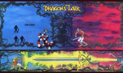
ORIGINAL QA VERSION SCAN lowres.jpg

The Dragons Lair Fans version is closer to a correct colour match but horrendously over saturated and has an incorrect font used for the ‘SWORD’ text and the 1 & 2 Player icons are the wrong shape. The scanner used was a lower quality unit as can be seen in the chromatic aberration (green and red fringing) visible throughout the image, but especially obvious on the snake and knight.

Black hole cut out marks have also been added making exact alignment with the control panel a requirement in order to fit the art properly.

I have seen derivative versions of this artwork where the black holes have been filled in but the art retains the extreme over saturation of colour and chromatic fringing. The black bars, top middle and bottom are razor sharp and do not contain any edge texture that should be present. This is the same for the knight icons and the ‘SWORD’ text.

It is cropped correctly to the sides but not top and bottom.
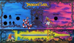
DLF VERSION lowres.jpg
DLF VERSION SCAN lowres detail1.jpg
As you can see there is green and red fringing to the image from a cheap scanner head.
When compared to my original scans and photographic reference its easy to see how over saturated the entire thing is too.
NOS-Control-Panel-Overlay-2.jpg

And now there is my version that’s been generated from old scans and new scans from a number of sources.
I did reach out to the guy who had the original scans used in the DLF version but he had sadly lost them and I wanted to sart from a clean and accurate slate.

I have worked hard to replicate the colour pallett of the original and dial in as much detail as possible, giving a clear crisp image with natural colours that are not over saturated.
Its got the correct font used for 'SWORD' and the correct shaped knight icons in the correct positions. There are no cutout holes making mounting it much less tricky.

Here are some comparisons of the three versions.
Comp001.jpg
Quater Arcade Left, DLF Center, My version Right.
Comp002.jpg
Quater Arcade Left, DLF Center, My version Right.

And the complete image.

final lowresoo1.jpg

Due to the scans being from a CMYK output what you see is pretty much what you will get from the printer.

I’m currently having it digitally output onto Lexan and have spent quite some time tracking down the correct thickness and texture of material I think was used in the original.
Should have the printed CPO back next week ready for install on the control panel.
 
Last edited:

BlueAdept

Newbie
Credits
5CR
/wave DN! It's Brian.
The purple is way off with all the repos.
As you can see, this is a proto, an original, and my original painting.

If you can get it to look like the original, I would like to buy one. My repo bothers me every time I look at it.
 

Attachments

  • cp_alt (1).jpg
    cp_alt (1).jpg
    113.5 KB · Views: 19
  • cp_eur.jpg
    cp_eur.jpg
    83.8 KB · Views: 16
  • PXL_20260115_022859210.jpg
    PXL_20260115_022859210.jpg
    69.2 KB · Views: 20

Mikonos11

Active member
Credits
92CR
Hi Conan!

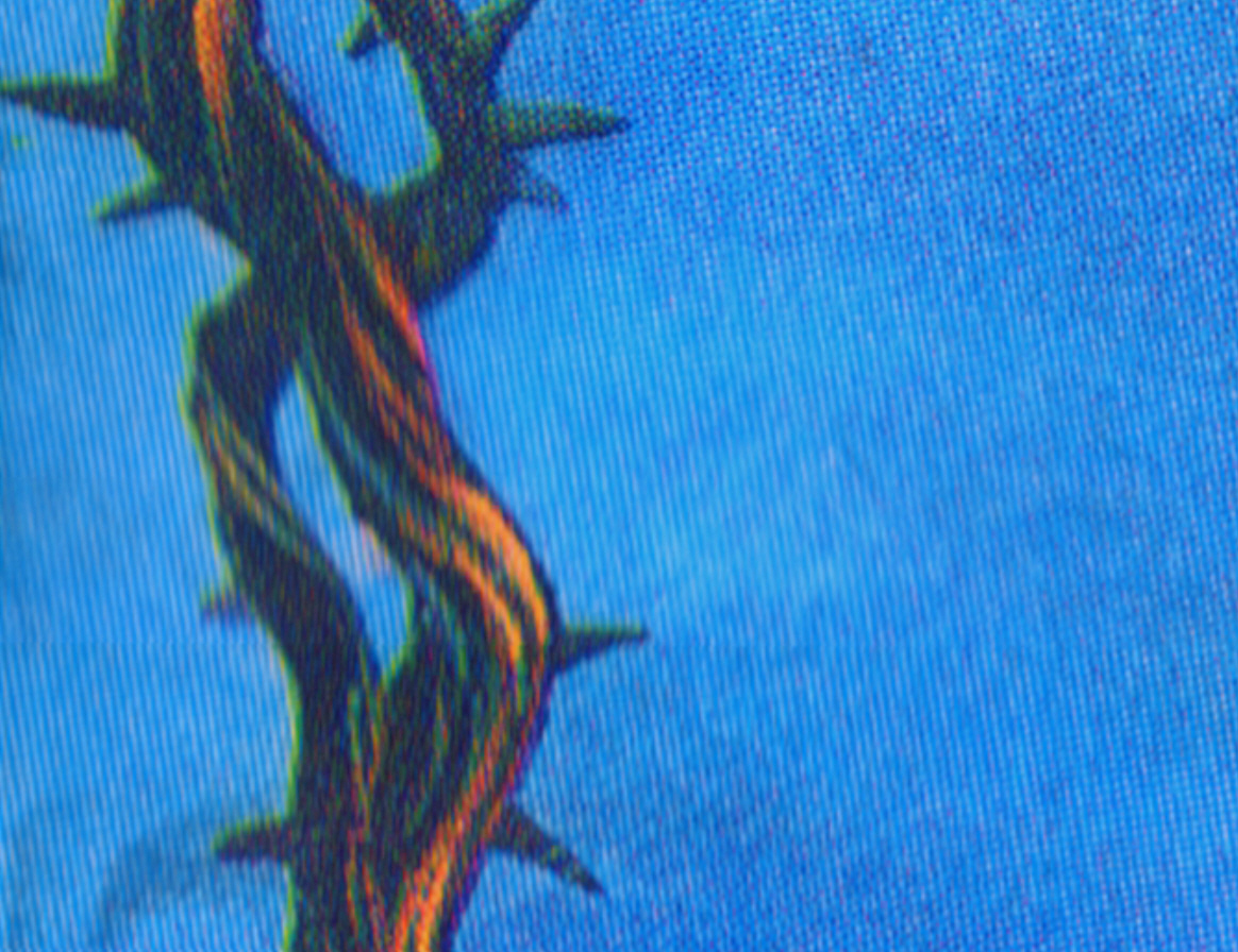
I like seeing other users tackle more complex restoration projects. I worked on the copy you're working on a while ago, and one of the things I did was recover the details of the bramble bush, as it seemed too dark to me.

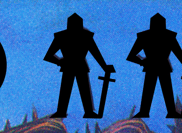
I think this art has some very significant problems caused by an unknown artist who tried to fix some things incorrectly. I think you know what they are, but I don't understand why you haven't mentioned them, since they'll be noticeable in the print and anyone interested in a copy might be disappointed.

Let's look at some of them:

Blurry areas affecting the main drawing
Dragons-lair- CPO-Problem1.jpg


Overlapping of poorly sized silhouettes
Dragons-lair- CPO-Problem2.jpg


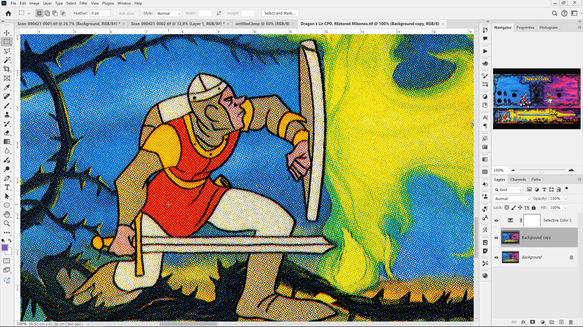
Poor assembly and cloning work
Dragons-lair- CPO-Problem3.jpg


Personally, I believe that if someone is genuinely interested in a new copy of this artwork for the control panel, they should start with a new scan and have the restoration work done by someone with proven experience and expertise in restoration—someone like me (I hate to be immodest, but I haven't found anyone like me since I started restoring, when I was less experienced than I am now).

I also believe that simply changing the color of a file like this and printing it on high-tack vinyl so it doesn't peel off isn't the solution to meet the demand for new pieces of this type. Keep in mind that the reason traditional companies have stopped producing them is precisely because of customer complaints and their inability to perform decent restorations.

My intention isn't to discourage anyone, not even you, but we shouldn't be misled about the quality of the material we're working with.

Cheers!
 
Last edited:

BlueAdept

Newbie
Credits
5CR
I have a scanner now. So when I get time (probably won't be for a while though) I will do a montage of the artwork (better than I did before) and try to get a more complete/correct image. With photoshop I am able to fix the position of the snake and dirk, but I am not happy with certain sections of it. It is a pain since I don't know photoshop real well but the one I already did looks good.
What will hurt the project is the lower section. Since I done have that painting of the sword, I will have to see if AI can sharpen and increase the resolution.
I am in talks with someone that still produces the control panel. He gave me his scans that he uses but they are not nearly the quality of the scans of the panel. I tried AI to increase the depth, fix the color but it screws up dirks face. So I need a better scan of the sword. I am going to try to scan the A1up sword panel to see if I can work with that.
 

Mikonos11

Active member
Credits
92CR
I'm going to write down how to scan the control panel in a tutorial that I'll send to all the fans of my restoration work who request my help. It's a series of points so I can do my restoration work better and faster.

*My intention isn't for me to do this restoration work if those interested don't trust me; rather, if someone takes on this project, I want them to do it correctly. So I'm providing the information without obligation.

I'm adding a note before posting the tutorial: This work needs to be scanned at 600 dpi to have room to maneuver when correcting certain parts and reconstructing the holes for buttons, joystick, and screws, which is something I always do, because all that dot pattern has to be hand-painted to fill the gaps.

Another important thing: due to the folds in this control panel, the control panel overlay needs to be removed with heat and scanned flat.

Where can you get this done without breaking the panel into pieces? At an auto body shop, by heating the entire panel evenly to soften the original adhesive and easily remove it in one piece. Therefore, I don't recommend anyone attempt this without experience.

Now, here's the tutorial:

How To do A Perfect Scanning Work:

0) Disable auto-cropping and any other effects that alter the raw file (for example, autofocus)

1) Scan at 600 DPI and tiff, bmp or png format if you can. If not, 300 dpi.
2) Clean piece to scan so well, with alcohol in some cases.
3) Clean the Scan machine's glass with a cotton cloth and alcohol (almost the first time). Clean all around of the scan machine too with some wet piece of cloth.
4) IMPORTANT: Scan in complete darkness. Turn off your computer monitor or turn back/down. This way you can avoid brightness differences between scanned files.
5) Press piece against scan machine's glass. If you can down the cap, put some weight over it in a homogeneous way, but press the piece lightly for to avoid burred scan files.
6) Clean the piece and scan machine's glass every 2 scan for to remove dust.
7) IMPORTANT: Overlap 5 cms (2 inches approx.) between scan files.
8) Don't change scan machine orientation for to scan. If you started taking horizontal scanned files, follow with the same orientation and without turn 90º or 180º your machine.


Best Regards


Mikonos (Zona Arcade's Webmaster)
 
Last edited:

conan

User
vacBacker
Feedback
1 (100%)
Credits
182CR
Hi Conan!

I like seeing other users tackle more complex restoration projects. I worked on the copy you're working on a while ago, and one of the things I did was recover the details of the bramble bush, as it seemed too dark to me.

I think this art has some very significant problems caused by an unknown artist who tried to fix some things incorrectly. I think you know what they are, but I don't understand why you haven't mentioned them, since they'll be noticeable in the print and anyone interested in a copy might be disappointed.

Let's look at some of them:

Blurry areas affecting the main drawing
Dragons-lair- CPO-Problem1.jpg


Overlapping of poorly sized silhouettes
Dragons-lair- CPO-Problem2.jpg


Poor assembly and cloning work
Dragons-lair- CPO-Problem3.jpg


Personally, I believe that if someone is genuinely interested in a new copy of this artwork for the control panel, they should start with a new scan and have the restoration work done by someone with proven experience and expertise in restoration—someone like me (I hate to be immodest, but I haven't found anyone like me since I started restoring, when I was less experienced than I am now).

I also believe that simply changing the color of a file like this and printing it on high-tack vinyl so it doesn't peel off isn't the solution to meet the demand for new pieces of this type. Keep in mind that the reason traditional companies have stopped producing them is precisely because of customer complaints and their inability to perform decent restorations.

My intention isn't to discourage anyone, not even you, but we shouldn't be misled about the quality of the material we're working with.

Cheers!
I have not mentioned any of the old issues because I fixed all of them and I have a scan from Brian but that scan creates yet more problems.
There is no super high quality scan of the original artwork for the front section of the control panel, the dragon sword and fire area.
Using AI doesnt represent the original art and thats the whole point of doing a proper version. I could go in there and hand paint over the top of all the thorns, dragon, fire etc but, again, that would not be an accurate reproduction of the original, so its pointless.
Im currently including the correct colour pallet from the new scan into my version whic should create a very good solution.
BTW I have been creating original game art and retouching for decades, art for Electronic Arts, Namco, THQ, Sony and a lot more...
 

conan

User
vacBacker
Feedback
1 (100%)
Credits
182CR
I will also add that I have used a calibrated Mitutoyo SJ-210 roughness tester on the original overlay and gone out and found as close as possible material with the same texture.
 

Mikonos11

Active member
Credits
92CR
BTW I have been creating original game art and retouching for decades, art for Electronic Arts, Namco, THQ, Sony and a lot more...

Well, I'd love to see the problematic details mentioned resolved. Apart from me, nobody usually posts their restorations in detail.

Regarding the file you showed in this thread, I made sure it was the same file I had before commenting, which is why I decided to post.

The front of the CPO isn't affected compared to the rest of the file, as I explained, or at least nothing significant.

Dragons Lair Control Panel Overlay sample at 100% of its original size, scanned at 300 dpi. I think it's perfect as it is, except that the red needs to be perfect, as well as the rest of the colors (download this image to see it full size).
Dragons-lair- CPO-Sample1.jpg


Personally, I think you've toned down the color too much, and we know that screen prints, even offset prints, usually use very pure and intense tones. A scan of arcade artwork represents a shadow of what we can perceive in reality with our eyes (it sounds very much like Plato's "world of ideas").

I think it's fantastic that you've worked for those big video game companies, but restoration work isn't related to many other aspects of graphic design.

Until now, I've always felt like I've been walking this path of restoring arcade and pinball artwork alone. I haven't found anyone like me, and I'd love to meet someone, so I encourage you to post more details for the enjoyment of others and myself.

Best regards

M
 

conan

User
vacBacker
Feedback
1 (100%)
Credits
182CR
There is plenty of reference material out there with much more muted colours than the horrendous, oversaturated crap floating about. From batch to batch, the printing on those CPOs was different, so it's naive to assume everything was heavily saturated. I went out and gathered as much reference as I could, including my own original CPO, so this desaturation has been arrived at through time and effort in research, not presumption.
 

John Bennett

Senior Member
vacBacker
Feedback
10 (100%)
Credits
5,009CR
Until now, I've always felt like I've been walking this path of restoring arcade and pinball artwork alone. I haven't found anyone like me, and I'd love to meet someone, so I encourage you to post more details for the enjoyment of others and myself.
I'd wager you're not the only person on the planet who touches up video game art.
 

Mikonos11

Active member
Credits
92CR
There is plenty of reference material out there with much more muted colours than the horrendous, oversaturated crap floating about. From batch to batch, the printing on those CPOs was different, so it's naive to assume everything was heavily saturated. I went out and gathered as much reference as I could, including my own original CPO, so this desaturation has been arrived at through time and effort in research, not presumption.
As I mentioned, you may have your own color preference, but in offset printing, cyan is 100% saturated, magenta is 100% saturated, yellow is 100% saturated, and so on. If red predominates in Dirk's suit, that red will be a pure red (100% magenta and 100% yellow), not an orangey version of the color sprinkled with yellow dots.

CMYK printing is already muted enough if not handled correctly without you lowering the color even further, but it's your file and your printed reproduction. I'm not interfering with your preferences; I'm stating an objective and incontrovertible fact. I'm telling you this without any ill will.

Cheers!
 
Last edited:

Mikonos11

Active member
Credits
92CR
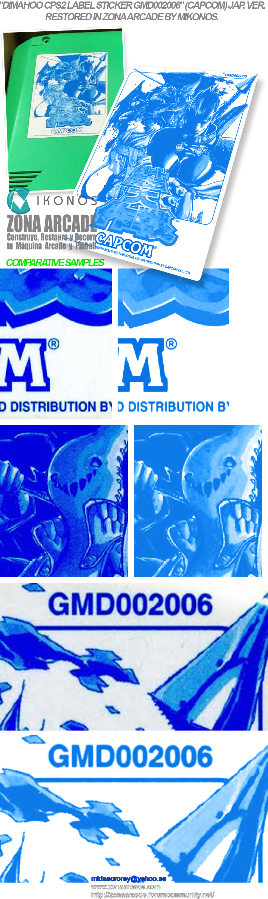
John Bennett (I love "Pride and Prejudice"), I don't know why you reacted with a sad emoticon, but I suppose it has to do with my comment about people ruining scans despite their good intentions. Actually, I just finished restoring something that someone had damaged because they didn't have enough knowledge to retouch it graphically. Unfortunately, some details of the drawing were lost. I know this because I had previously restored the US version of this artwork that I'm going to show myself. Please judge the matter for yourself (I'm showing it for the first time; we haven't shown it on my forum yet).

"Dimahoo CPS2 Label Sticker GMD002006" (CAPCOM) artwork restored by Zona Arcade and Mikonos.
Dimahoo-CPS2-Game-Board-Label-Sticker-GMD002006-Restored-Mikonos1.jpg


Cheers!
 

CMYKhazi-Dan

Saikyo Style 💪
vacBacker
Feedback
2 (100%)
Credits
1,315CR
John Bennett (I love "Pride and Prejudice"), I don't know why you reacted with a sad emoticon, but I suppose it has to do with my comment about people ruining scans despite their good intentions. Actually, I just finished restoring something that someone had damaged because they didn't have enough knowledge to retouch it graphically. Unfortunately, some details of the drawing were lost. I know this because I had previously restored the US version of this artwork that I'm going to show myself. Please judge the matter for yourself (I'm showing it for the first time; we haven't shown it on my forum yet).

"Dimahoo CPS2 Label Sticker GMD002006" (CAPCOM) artwork restored by Zona Arcade and Mikonos.
Dimahoo-CPS2-Game-Board-Label-Sticker-GMD002006-Restored-Mikonos1.jpg


Cheers!
It appears that you have introduced colourful artifacts into the white areas that don’t or didn’t exist in the image you “corrected”.

Just my observation of working in design for over thirty years.

I am telling you this without any ill will.
 
Top